
Goal
Increase sign-up completion by reducing unnecessary friction and improving clarity across the journey, without changing the underlying business requirements or rebuilding the flow from scratch.
Constraints
Eligibility proof was mandatory during sign-up
Delivery address and payment were required
Most offer content had to remain behind the paywall due to partner contracts
Account creation and email verification were handled via Auth0, with limited customisation due to the implementation
Engineering capacity was limited, so only targeted UX improvements were in scope
My role
I led the UX improvements across the end-to-end sign-up and onboarding journey. I combined heuristic analysis, quantitative data, and qualitative research (user interviews, session replays) to identify where and why users dropped out, then partnered closely with product and engineering to prioritise high-impact, low-effort changes. I iterated on solutions through design critiques before supporting implementation and delivery.
65% of sign-ups occurred on mobile web, with under 2% on native app, so efforts focused on mobile web improvements.
Account creation showed high apparent drop-off, but deeper analysis revealed most users navigated to Log in rather than abandoning.
The biggest genuine drop-off occurred at eligibility verification, where users were asked to prove their status.
The second major drop-off happened at employment details, where users provided information about their work or volunteering history.

Identifying the major drop-off points in the funnel was just the first step. To improve the experience, we needed to understand why users were abandoning, so we combined qualitative research with session replay analysis. Key insights included:
Problem: Some members lacked immediate access to those documents, triggering abandonment.
Solution: Set expectations early and reiterate the value proposition. Introduced a new screen at the top of the funnel to reduce confusion and abandonment later in the flow.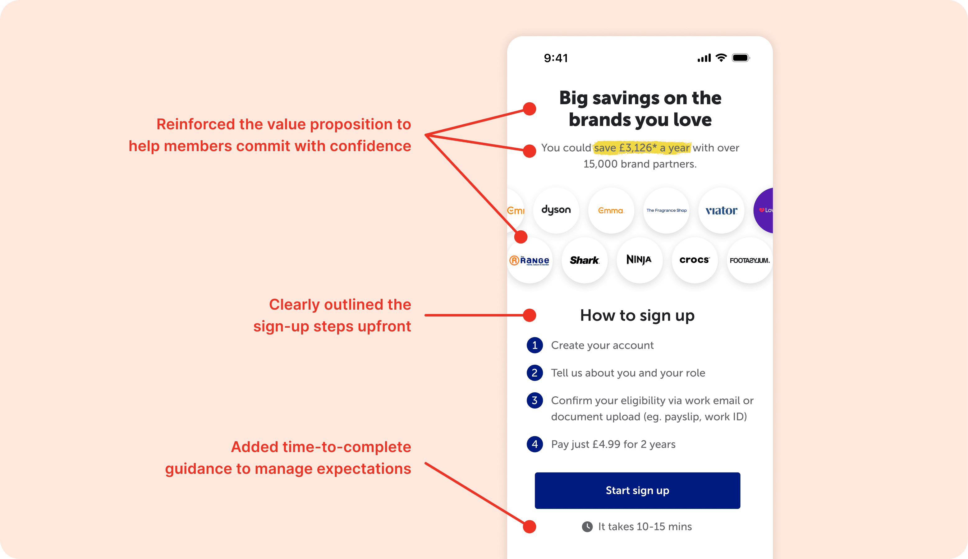
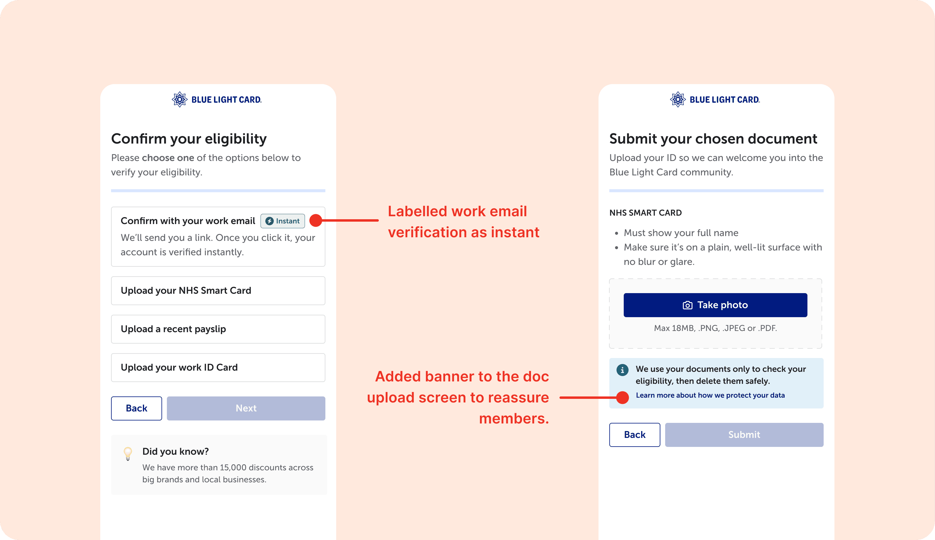
Problem: Eligibility document upload felt intrusive or inconvenient for some members, and privacy concerns occasionally caused hesitation. Work email verification was perceived as easier and less intrusive than uploading documents.
Solution: Privacy reassurance at document upload. Added messaging to reassure members about how their documents are used, addressing concerns about intrusiveness and privacy. Labelled work email as instant, encouraging users to use it when possible.
Problem: Users found the date of birth picker clunky and unintuitive. Retired members in particular assumed they had to navigate back month by month to reach their birth year.
Solution: Redesigned the date of birth component using the gov.uk design system, improving accessibility and making year selection faster and more intuitive, especially for older users.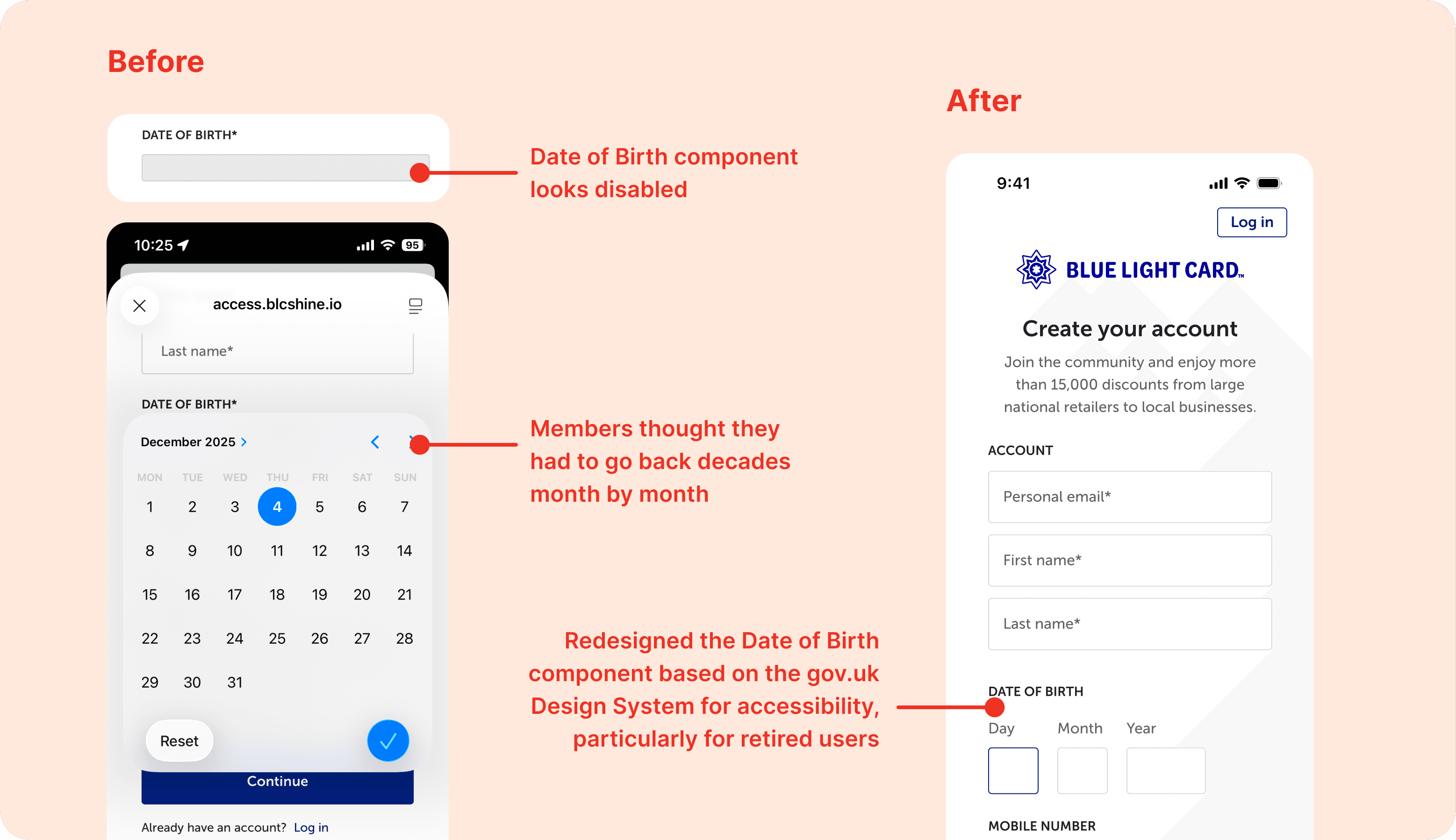
Problem: Users misunderstood the radio buttons, confusing them with other UI elements and thinking they needed to go through every option rather than select one.
Solution: Updated the visual styling to make radio buttons clearly selectable and reinforce that only one option is required.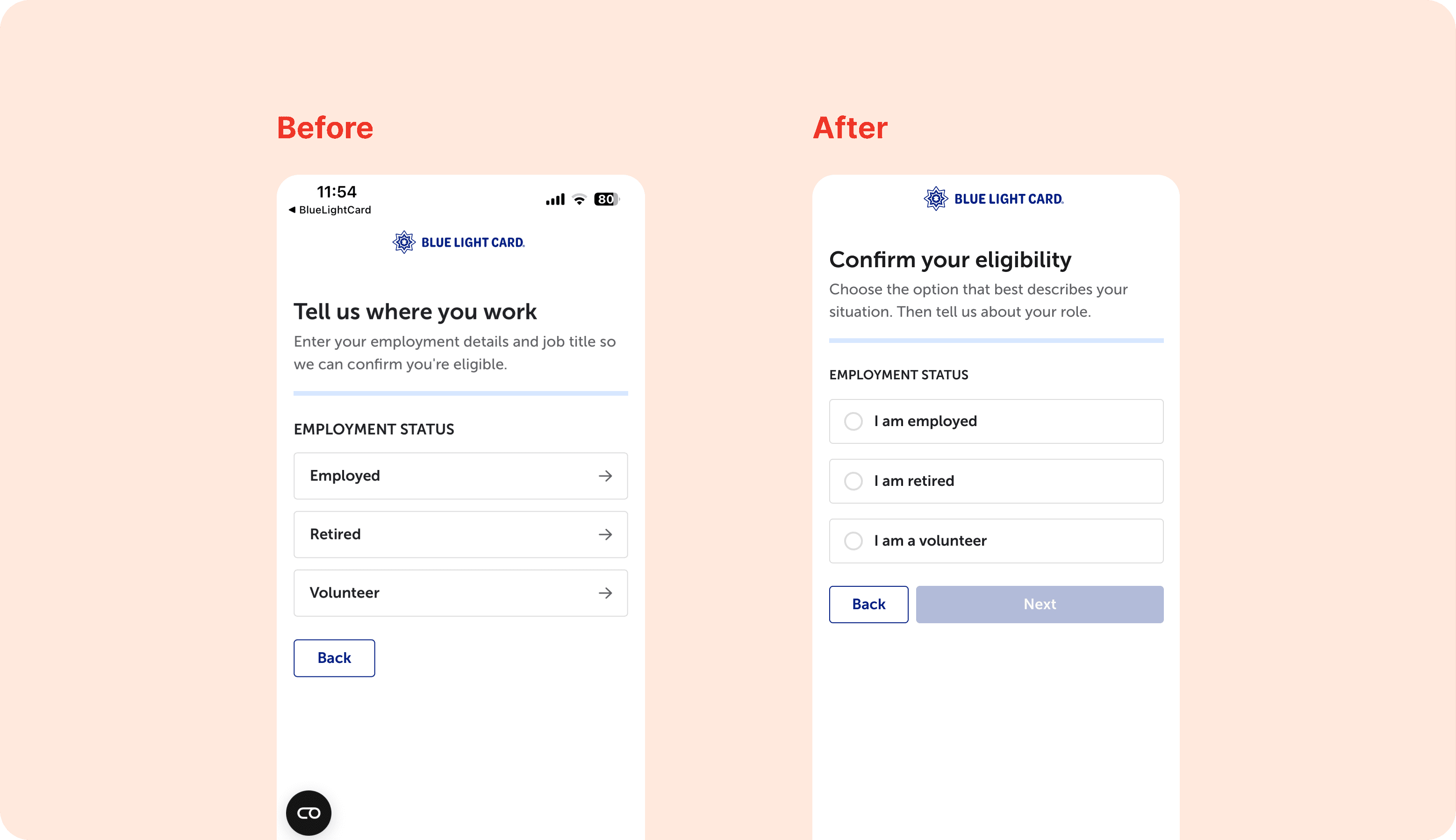
Problem: Retired members were presented with too many verification options, leading to choice paralysis and uncertainty about which path to take.
Solution: Reduced the options to two clear choices and added concrete document examples within an accordion to guide users with confidence.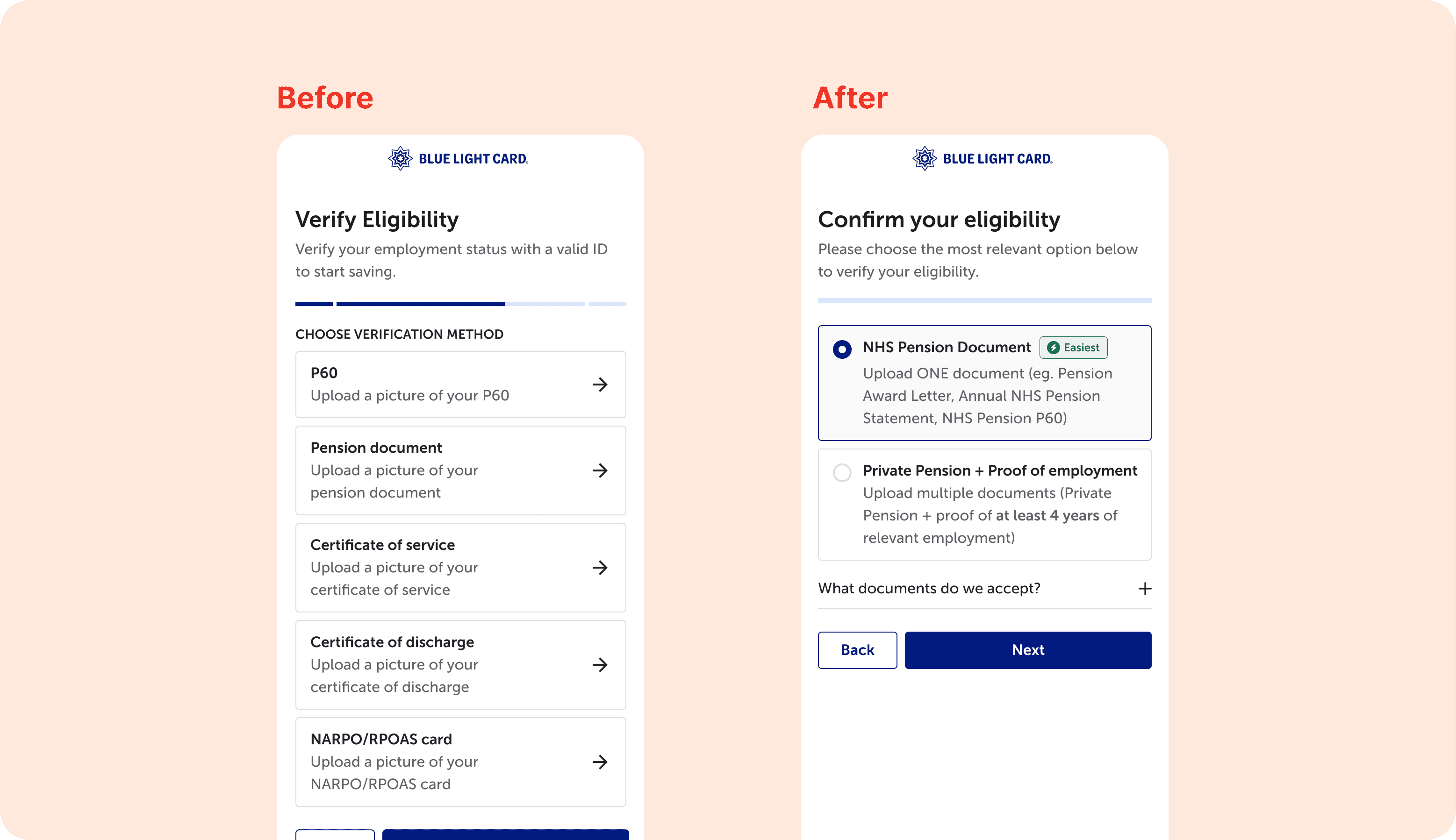
While not all of this work has shipped, one key change was implemented in the retired member journey by consolidating eligibility verification options. This resulted in a conversion increase from ~49% to ~52%, outperforming both the pre-change flow and the typical non-retired funnel (~46%), validating the decision to reduce choice overload.
The remaining improvements were designed to reduce abandonment driven by uncertainty, privacy concerns, and unclear expectations. Once fully shipped, success would be measured through higher completion rates at verification and employment steps, smoother navigation, and fewer support tickets during sign-up.
This work surfaced the limitations of a one-size-fits-all eligibility journey. Larger services and groups (NHS, Police, Retired) would benefit from more tailored verification paths that better reflect their users’ expectations.
Looking ahead, breaking onboarding into clearer stages presents a strong opportunity. Separating account creation from eligibility verification and deferring verification until a moment of value could reduce upfront friction.
On a personal level, this project deepened my appreciation for data-informed design. Analysing funnel data allowed us to focus effort on the highest-impact pain points, ensuring design time and engineering resources were spent where they delivered the most value.
