
Context
Landing pages are crucial for Blue Light Card because most of our value, especially offers sits behind a paywall. Prospective members need a simple way to understand the benefits, check eligibility, and see the savings they could unlock before committing. Landing pages bridge that gap by communicating value upfront, tailoring messages to specific audiences, and powering seasonal marketing campaigns with focused, high-converting experiences.
My Role
To reduce reliance on engineering and increase our speed to market, I took the initiative to learn Framer and introduced it as a new way of designing, building, and shipping landing pages. This allowed me to deliver modern, responsive pages end-to-end while improving user experience and unblocking key marketing activities.
The Problem
Our ability to launch new landing pages and support marketing campaigns was limited by the lack of a CMS and a backlog of technical requests. As part of our wider modernisation programme, I saw an opportunity to introduce a faster, more flexible way of building pages.

Learning by Doing
My first project was the Deal Finder landing page: an educational piece on our Chrome extension. I designed and built a fully responsive, mobile-first experience that still felt rich on desktop, validating that Framer could meet our needs.
Scaling
Once the first page launched, the value was immediately clear: one designer could now deliver high-quality landing pages without engineering involvement. Requests quickly started coming in from across the business, especially marketing.
We shipped acquisition pages for Retired, Social Care, and Teachers (major new audiences), as well as seasonal campaigns like Black Friday, the Christmas Shop, and Spring Saver.
Introducing a Framework
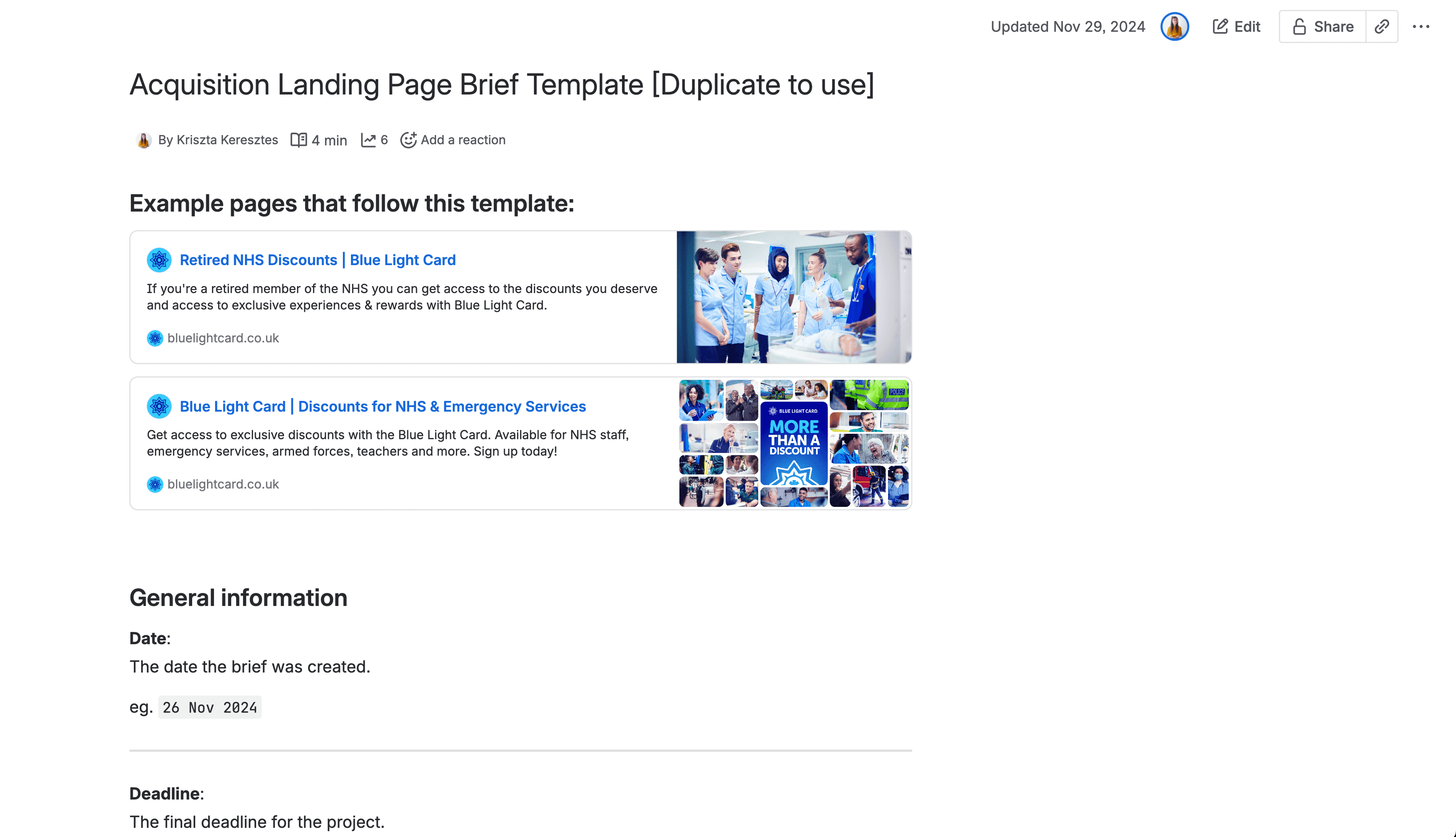
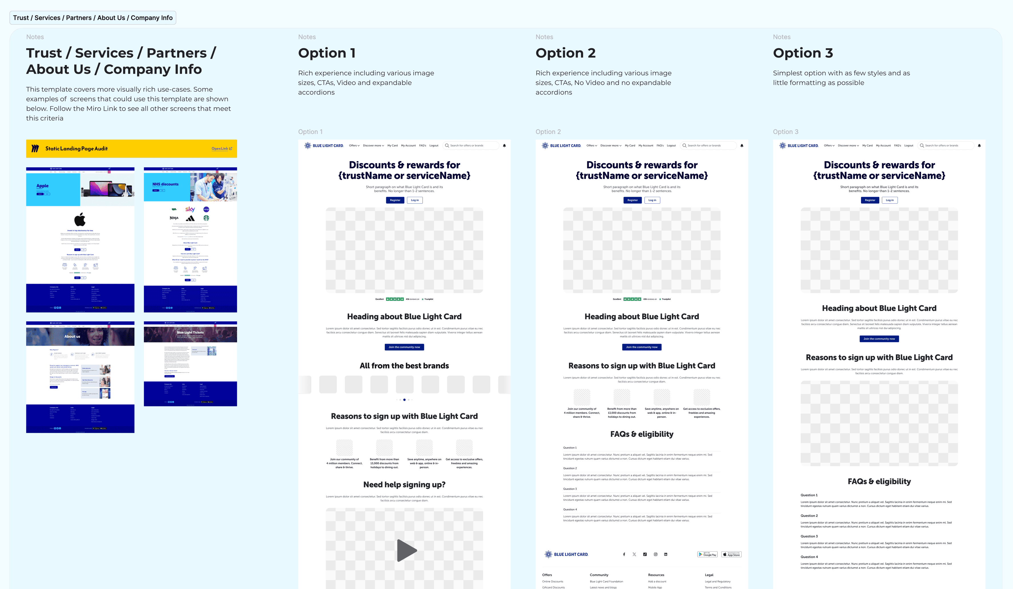
As demand grew, I introduced a standardised briefing template and built a set of reusable Framer components to streamline how we created landing pages. This brought consistency across designs, reduced both design and build time, and enabled the team to ship pages with a cohesive look and feel. I also set a clear process with a maximum of two feedback rounds, which cut down last-minute changes, reduced noise from stakeholders, and made it far easier to meet deadlines with predictable, organised workflows.
Empowering Teams
When Framer released its CMS, I adopted it immediately. It allowed frequently changing offer content to be updated without touching the UI. I trained marketing and partnerships teams on how to use it, freeing up design time and giving them real ownership.
Migrating to Our New Company CMS
As part of our wider modernisation programme, we later introduced a new internal CMS for all logged-in and logged-out content. I worked with engineers to build React components and map them to each CMS module, then rebuilt every landing page in the new system. I also trained the marketing team to manage updates independently and added guardrails to maintain brand and design consistency. This shift removed design and engineering as bottlenecks and significantly reduced operational effort across teams.
Our Teachers landing page achieved 1.2M+ page views, driving a high-performing waitlist during a period of operational backlog—capturing new members instead of losing them.
The Retired landing page increased CVR from 5% to 8% and reduced Cost per Sign-Up from £1.80 to £1.30 based on a Meta A/B test.
Tailored, relevant landing pages proved significantly more efficient, demonstrating how small content and layout improvements can deliver major gains in acquisition performance and cost efficiency.

One of the biggest challenges in this project was that neither I nor the wider business had experience with Framer. I had to learn the tool quickly while still delivering high-quality pages to support active campaigns. Building the first landing page was a mix of experimentation, trial and error, and rapid iteration — a process that taught me to be comfortable learning in public and moving fast without sacrificing quality.
As demand for pages grew, I realised that scaling this new workflow required more structure. I introduced a standardised briefing template, reusable components, and a focused feedback process, which dramatically reduced noise, improved consistency, and protected delivery timelines. This reinforced the importance of creating systems early, not just solutions.
Another key learning came when we transitioned to the new company-wide CMS. Rebuilding pages taught me the value of designing with future migration in mind, and training the marketing team gave them ownership while freeing up design and engineering time long-term.
Overall, this project showed me how powerful it can be when design introduces new tools and ways of working — not only to improve the user experience, but to unlock speed, autonomy, and efficiency across the business.
